Calibri — It’s Done, Bro!
Initially, I was hesitant about whether to write about it or not. But by now, my readers already know my style, so this was one topic missing from my list of writings. Moreover, when Microsoft has already decided to replace Calibri as its default font with another typeface, the change has certainly broken a few hearts.
Early in the morning, you reach your office and start typing. You don’t even bother about changing the font. Why? Because it was Calibri.
Microsoft introduced Aptos as the new default font for its Office applications in 2023, replacing Calibri after the latter had served as the default for around 15 years. But Calibri hasn’t disappeared; you can still select it from the font menu. And yet, for those of us who grew accustomed to it, something about this change feels personal.
The discussion around Calibri took another turn in December 2025, when US Secretary of State Marco Rubio ordered the State Department to return to 14-point Times New Roman for official communications. The department had adopted Calibri in 2023, partly to improve accessibility for people with visual disabilities.
Of course, Rubio’s decision had nothing to do with Microsoft’s decision to introduce Aptos as its default Office font. These were two separate developments. Yet, when you look at them together, you cannot help but wonder why a humble font like Calibri has found itself at the centre of so much discussion.
Who would have thought that a typeface could become part of such a debate?
Calibri and I: A Friendship That Lasted Years
The joy, satisfaction, and happiness of seeing your writing in Calibri are feelings that only ’90s kids and some generations of the 2000s can understand.
Even after the advent of Google Docs, Calibri’s influence was never in doubt. Whether you were using Microsoft Word, Google Docs, or spreadsheets, Calibri was a familiar presence.
For me personally, the change in Microsoft’s default font has brought back countless memories.
Just flash back a few years. I was in my late twenties and about to write a blog, perhaps my first or second one; I can’t recall that with certainty. Until then, I had mostly thought Times New Roman was the best font. That was until the day the computer administrator told me I should work with Calibri instead because it looked neater and cleaner—perfect for putting my content on the WordPress dashboard for publication.
Initially reluctant, I eventually gave it a try, and the rest was history, at least from my perspective, as I never had to look for another font.
If that weren’t enough, I can also recall how I completed my college projects exclusively in Calibri. Because once you start using Calibri, you don’t want to use other fonts. In case you know what I mean!
The rounded letters, the slightly bold appearance, the sharper edges, the line spacing, the alphabetical style… I can literally go on and on about what makes Calibri stand out from the rest.
Calibri Was Part of Our Lives
My fondness for Calibri doesn’t stop there. It was more like a best friend to me.
If I were to write a job application, it had to be in Calibri. If I were to finish a project, it had to be in Calibri. Then, if I were to write a deeply personal blog post for my website, it had to be in Calibri.
Gradually, I started forgetting other fonts. Whenever a typing assignment came my way, I comforted myself by saying, “Hi, Calibri!” because it was my go-to font for all types of content.
One, two, three, four, five… ten, twelve, fourteen, fifteen… and now, almost twenty years have passed since I first became acquainted with this sans-serif font. I had never imagined my life without it.
It’s okay, though. Calibri isn’t going anywhere. You can still find it in your font selection menu and use it in Microsoft programs wherever required. But having Calibri as the default font in Microsoft programs was magical in itself.
Even when I wasn’t particularly proficient in MS Word or WordPad, Calibri grabbed my attention. I never minded spending time on the computer; I never felt bored. All the credit goes to Calibri. The mere sight of this font could literally make my day. It refreshed my mind, gave me the much-needed mojo to write something new, type endlessly, and explore various other programs. And thus, our relationship grew stronger.
Breaking Up with Calibri
But, at the same time, my attachment to this particular font has distanced me from many others. Now that Microsoft has replaced Calibri with Aptos as its default font, its programs might look unfamiliar to me.
The first thing I’ll look at while typing in MS Word or Google Docs will be the font selection menu—something I otherwise took for granted because Calibri was the default font in the applications I used.
Back then, I was less bothered about which font I was using because it was Calibri all the way. But now, I’ll behave more self-consciously. I’ll check whether the font is Calibri or not. If it is, no problem. If it isn’t, I’ll change it back to Calibri. It may take mere milliseconds to do so, but those golden memories of my time with Calibri in the days of yore are hard to forget.
However, I might behave differently from now on!
What’s Next?
As I already told you, too much addiction is bad. Unfortunately, my countless encounters with Calibri have made me somewhat ignorant of other fonts. If you ask me now how many other fonts I know, what they look like, or which fonts would work better for different graphics on Canva or other software, I’ll draw a blank because I don’t have the answers.
I was so happy with this font that I was living in a sort of la-la land where other fonts were useless—or at least, that’s what I thought back then.
But now that Microsoft has embraced another font as the default in its Office programs, I’m bracing myself for new storms. I’m also ready to try out other fonts and see whether the world of typography has changed over the last ten to fifteen years or whether I’ve finally grown up and moved on from my obsession with this humanist sans-serif style font.
Conclusion
I don’t know what my experience with newer fonts will be like, as I’m taking a short break from using Calibri. All I can say is, “Dear Calibri—it’s done, bro!”
But do you really think I can stay away from Calibri for a long period of time, especially when it has been my constant companion from school and college to my first job and throughout my professional life?
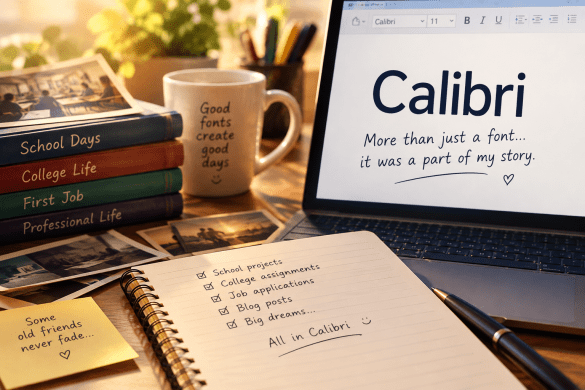
Calibri wasn’t just a font; it was a part of my writing journey, a silent witness to my growth, and a familiar presence through countless assignments, projects, and blog posts.
So, while I may experiment with other fonts, I don’t think my relationship with this font is going to end anytime soon.
Do you have any similar memories with Calibri? Just write them down in the comments section below. I’m all ears!
(Atish Home Chowdhury)